
o’hare airport
an airport navigation app redesign
5 week UI/UX project
project goal:
designing a digital screen display for Chicago’s O’Hare Airport. the designs will be viewed on a phone to communicate flight information to passengers in real-time. the goal is to effectively relay information to the user that is easy to comprehend and simple to navigate.
user journey through the current chicago o’hare airport app

wireframing of the redesign

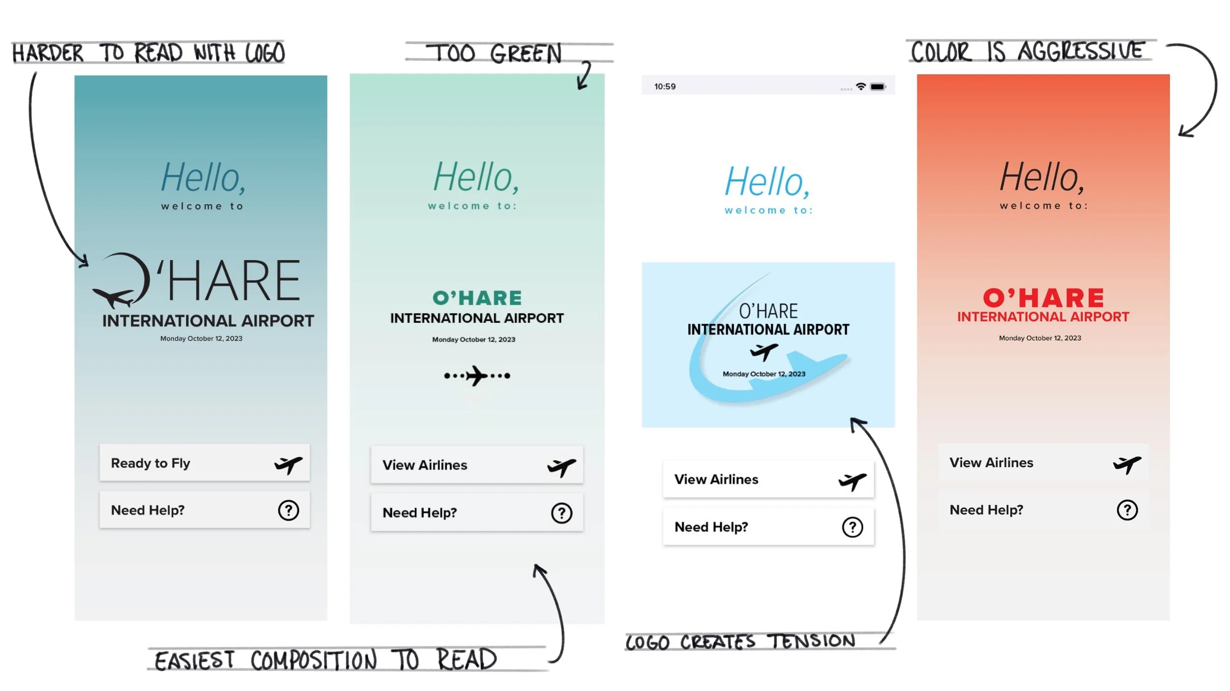
graphic sketches
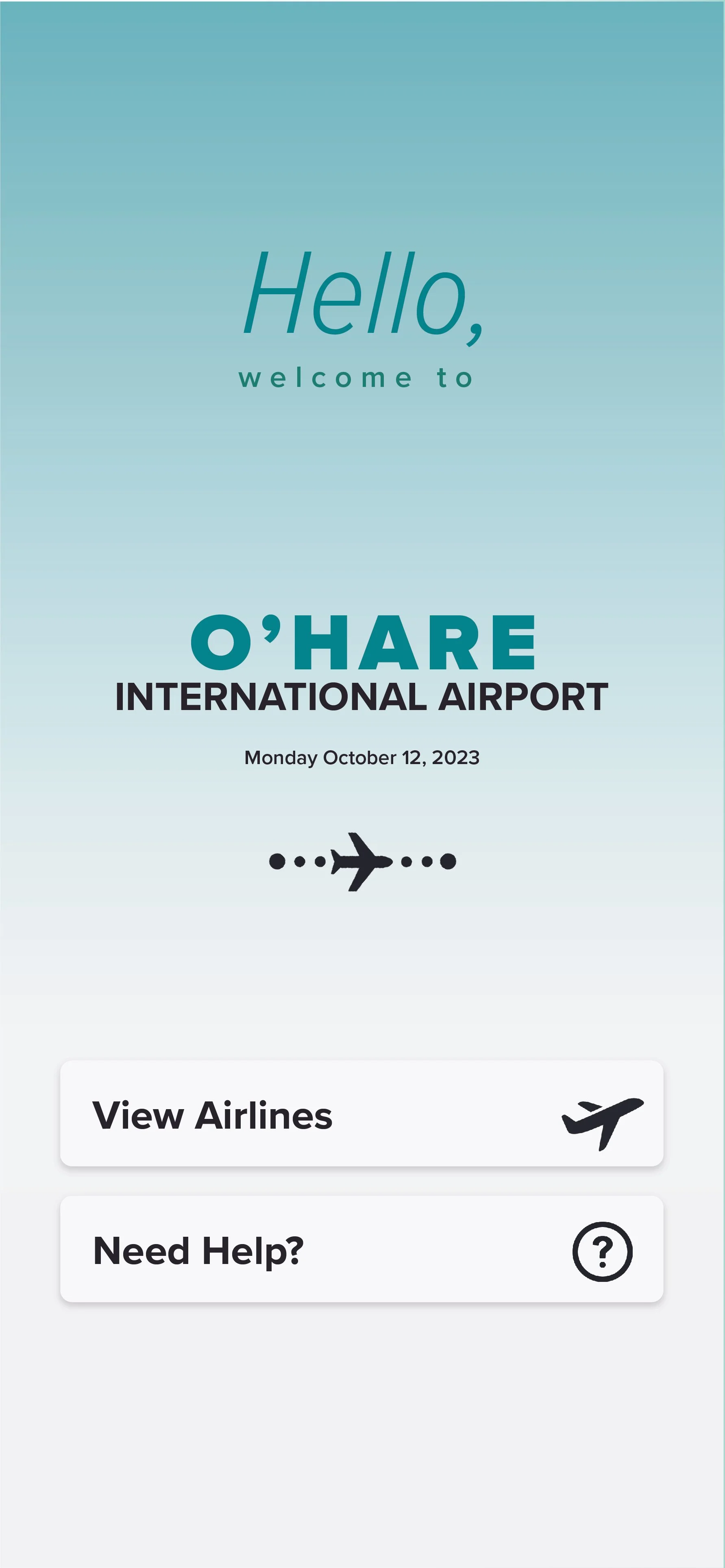
began adding graphics to my design. focused on creating a fun and welcoming home page that would make the user feel like they are going to have an easy and enjoyable experience on the app.

selecting a typeface…

when researching what typeface to use for this project i came across proxima nova. proxima nova is known as one of the most legible typefaces on digital interfaces. the varied stroke widths within the letterforms make individual characters more distinguishable and easer to read.
there is an estimated 300 million people around the world who are affected by color blindness.

when creating a color pallet for this project, I wanted to select a pallet that would be easily legible to those who experience color deficiency. after researching, I discovered that both red and blue pallets are the most colorblind-friendly.
introducing color
began to add color to my iterations of my home screen. I focused on using colors that would be easy to read for someone with colorblindness and also explored what colors looked the most inviting.
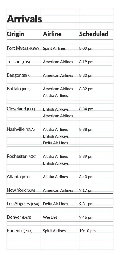
formatting pages
began to format my pages in indesign. focused on creating a tabular type system that is easy for the user to comprehend and navigate.
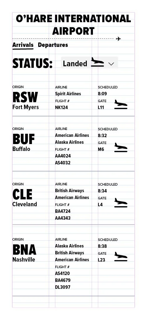


creating icons
using a consistent image, I created an icon that visually describes the status of each individual flight.

landed

delayed

cancelled

in air

on time
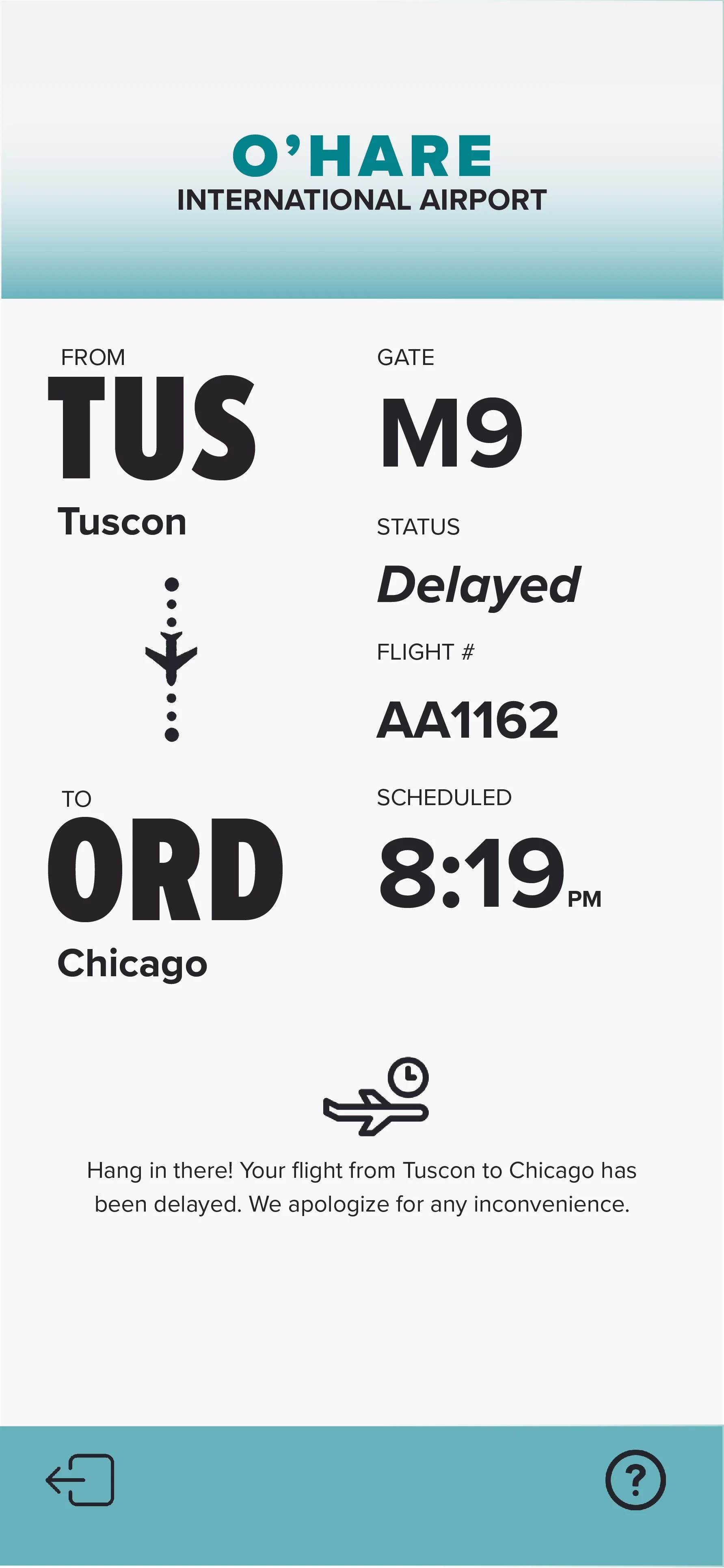
final aesthetic of pages
after finishing my layout of each individual page, I placed them all together to see what the final aesthetic would look like for a user when they are interacting with my design.


walkthrough of final design
created a video that shows the sequence of the pages that the user would likely go through when using the interface. I wanted to display each individual page in this video to demonstrate the order of events when walking through the design.

